Beacon reports live in the Analytics tab of the Publisher App, alongside your customer, product and settings data.
If you used the standalone Beacon dashboard at app.ledebeacon.com, that site has been retired. Sign in to the Publisher App instead. Every report the old dashboard offered is here, plus subscription and revenue reporting it never had.
Getting there
- Go to app.joinlede.com and sign in.
- If your account covers more than one publication, pick the one you want from the Switch publisher menu at the top right.
- Click Analytics in the top navigation.
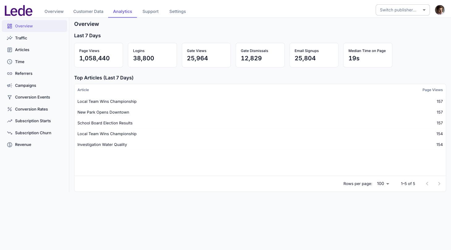
You land on the Overview, a seven-day summary. Every other report is one click away in the list on the left.
The screenshots in this guide come from the Lede FYI demo publication, so every figure in them is sample data.
Who can see it
Anyone who can sign in to your publication in the Publisher App can open the Analytics tab. There is no separate analytics permission to request and no extra role to assign.
Subscription Starts, Subscription Churn and Revenue appear only if your publication has at least one active product. If you do not sell subscriptions, you will see the eight traffic and conversion reports and nothing else — that is expected, not a fault.
Choosing a report
The list on the left switches between reports. On a narrow screen or a phone it collapses into a single dropdown directly beneath the page heading.
- Overview — a fixed seven-day summary with your top articles
- Traffic — page views, sessions and unique users over time
- Articles — page views per article
- Time — how long readers spend on each article
- Referrers — where your traffic came from
- Campaigns — traffic by UTM campaign tag
- Conversion Events — gate views, dismissals and sign-ups over time
- Conversion Rates — sign-ups as a share of gate views
- Subscription Starts — new subscriptions and gift redemptions
- Subscription Churn — cancellations, broken down by product
- Revenue — recognised revenue over time
The first six are covered in Traffic and content reports; the rest in Conversion, subscription and revenue reports.
Setting the date range and interval
Every report except the Overview has the same three controls.
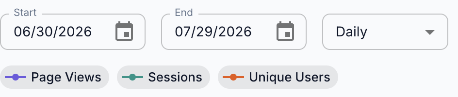
- Start and End set the window. The default is the last 30 days, ending yesterday. The end date is inclusive — the whole of that day is counted.
- The unlabelled dropdown sets the interval each row and point covers: Daily (the default), Hourly, Weekly or Monthly.
The end date defaults to yesterday, not today, because the most recent day is always incomplete — see What is Beacon? for how far behind the data runs. If you set the end date to today, expect the last point on the chart to dip.
Your date range and interval are stored in the page address and carry over when you switch reports, so you can set the window once and click through every report. You can also bookmark or paste a link to a specific report and date range for a colleague.
Hourly over a long range produces thousands of points and a chart you cannot read. Use it for a few days at a time, and Weekly or Monthly for anything longer than a couple of months.
Reading a chart
The coloured chips above each chart are both the legend and a filter. Click one to hide that series; click it again to bring it back. The chip fades and turns into an outline while the series is hidden.
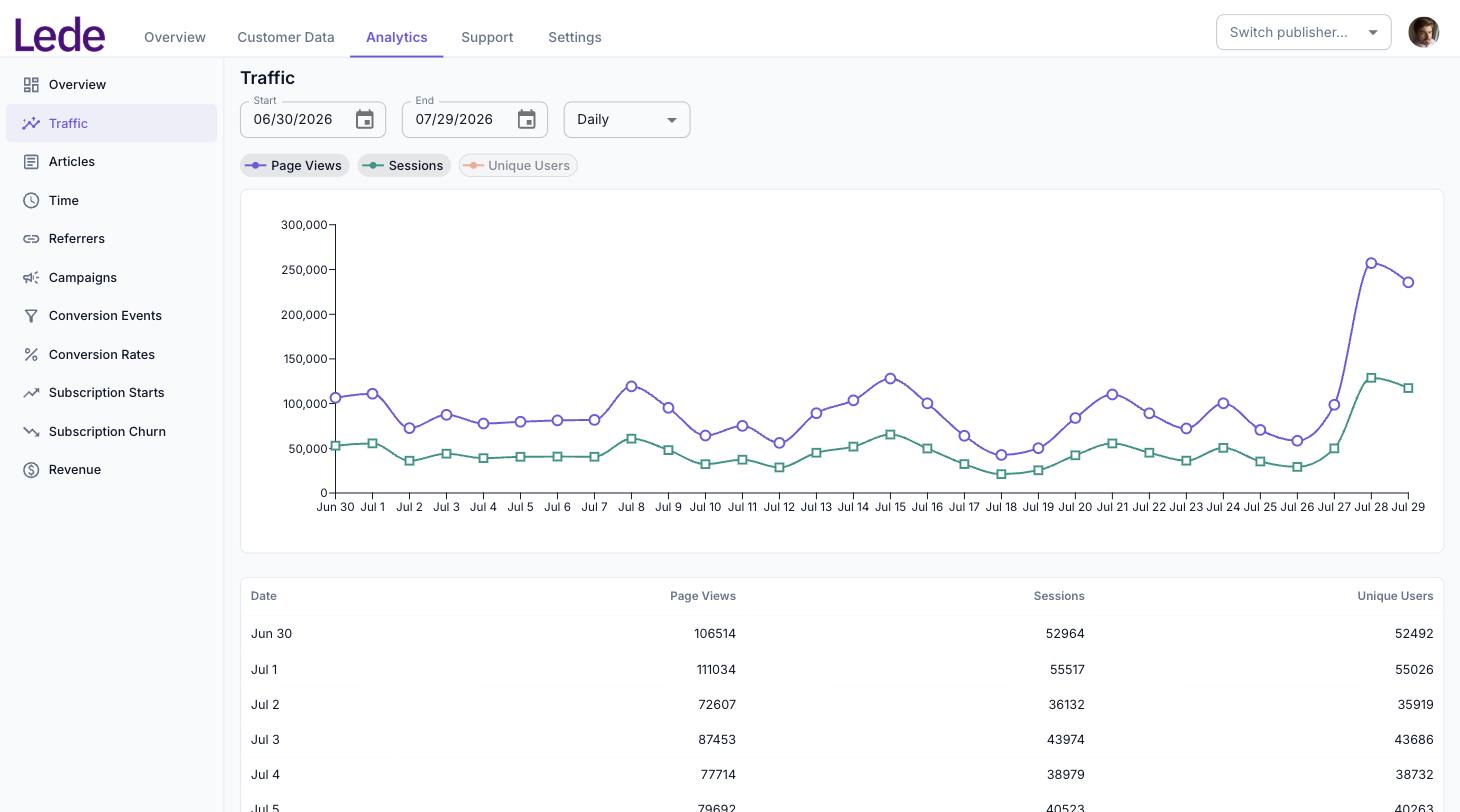
If you switch every series off, the chart is replaced by Select a series to display. The colours stay attached to the same series as you toggle, so a line does not change colour when you hide its neighbour.
The chart trims empty periods from the start and end of the range, so a chart may begin later than your start date if nothing happened yet. The table below it always shows every row in the range.
Below the chart, a Show query control reveals the exact warehouse queries used to build the report, each in a copyable box. Use the copy icon to grab the SQL — ready to paste into an AI assistant connected to your publication data (see Connecting AI Tools) or to include when contacting support.
Reading a table
Every report has a table under the chart with the same figures. Click a column heading to sort by it. Reports that rank things — articles, referrers, campaigns — chart the top 15 and list up to 250 rows in the table, so scroll the table if you want the long tail.
What the Analytics tab does not do
So you are not hunting for something that is not there:
- There is no CSV or spreadsheet export.
- There is no comparison against a previous period, and no percentage-change indicators.
- There are no preset ranges such as “last 7 days” — set the dates by hand.
- You cannot click an article in a table to open a report for just that article.
- You cannot break a report down by audience segment, subscriber status, country or device.
If you need something the tab cannot do — an export, a custom breakdown, a one-off analysis — open a support ticket. Your publication’s data can be queried directly in the warehouse, and Lede can either run the query or arrange access for you.
When a report looks empty
- No data to display in the chart and Nothing here yet in the table mean the report ran correctly and found no matching events in that range. Widen the dates, or check that the feature is one your publication uses.
- The analytics warehouse is not configured for this environment or Failed to load report mean something is wrong on our side rather than with your data. Open a support ticket.