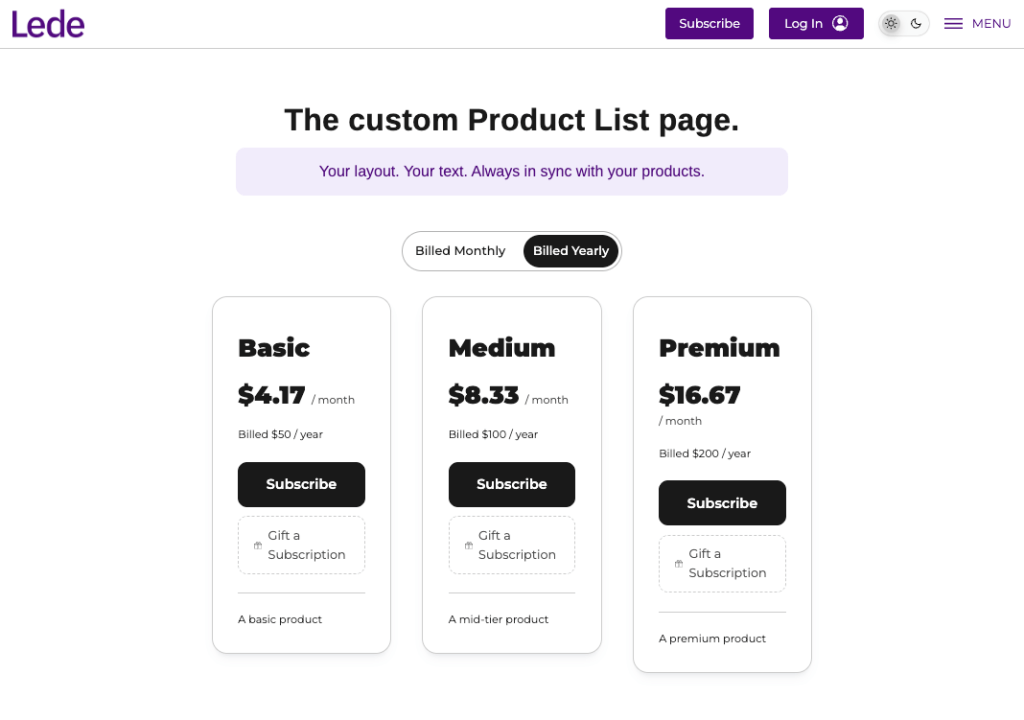
The Product List block places your subscription products, the same subscribe cards readers see on your products page, onto any page you build, so you can write your own headline and pitch around them. It lives in the Lede block category.
Use it when you want a membership or support page in your own voice, rather than sending readers off to the standard products page.
Where you can use it
The block is available on pages only. It is not available on posts, and not on your homepage. Your homepage is built differently and doesn’t load product data, so the block would come up empty there.
You can add one Product List block per page.
What it shows
The block renders every active subscription product you offer, with the same monthly and annual toggle as your products page. There is nothing to configure. It follows your products automatically, so a product you add or retire in the Publisher App appears or disappears here without anyone editing the page. Changes take up to 15 minutes to show.
Products that belong to a group are left out, exactly as they are on the products page.
If you have no active products, the block renders nothing rather than leaving a gap.
What you’ll see in the editor
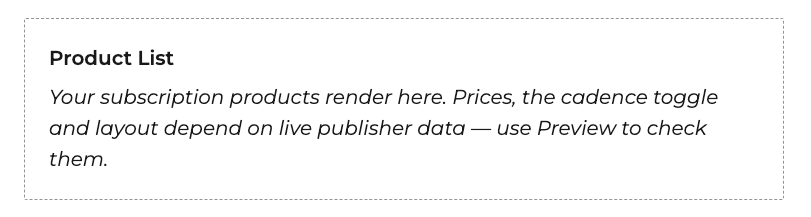
The editor shows a placeholder rather than live cards, because prices, the cadence toggle and the layout all depend on live data the editor doesn’t have. Use Preview to see the real thing.
Width and spacing
The block supports wide and full alignment, plus margin and padding controls in the block sidebar.
- Wide or full gives the cards room to sit side by side. This is usually what you want.
- Inside a narrow column the cards stack vertically. That works well in a sidebar. Leave the block at its default width there.
- Wide and full alignments keep a margin on small screens, so cards never run to the edge of a phone.
Putting it inside other blocks
The cards set their own heading, price and badge colors, so you can drop the block inside a colored Cover or Group block without text disappearing into the background. The monthly and annual toggle paints its own background for the same reason.
Common uses
- A membership page that makes your case for support above the cards
- A campaign landing page you link from a newsletter or a site banner
- An about or staff page that closes with a subscribe prompt
Pro tips
- Put your pitch in a Group block directly above the Product List, so the two move together when you rearrange the page.
- Use wide alignment on a full-width page template. The cards get room to breathe and the price comparison is easier to scan.
- Preview on a phone as well as a desktop. The cards stack on small screens, and a long pitch above them can push the prices out of sight.
- You don’t need to revisit the page when your products change. It updates on its own!