The Featured Topic block is a versatile homepage block that displays the most recent posts in a given Category or Tag. Adding this block to your homepage can help highlight your editorial focus by showing which categories you prioritize or publish most frequently. It can also demonstrate the variety and depth of your content across different topics. Users may value this block because it helps them quickly browse content and find what it is interesting to them.
Lede’s Featured Topic block can be configured in a number of ways. You can select the layout, number of posts, whether to display the CTA, whether to display the dek/subtitle, and how to display the bylines.
Layout Options
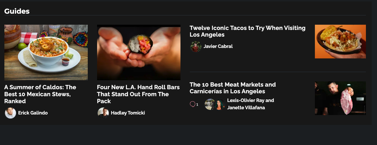
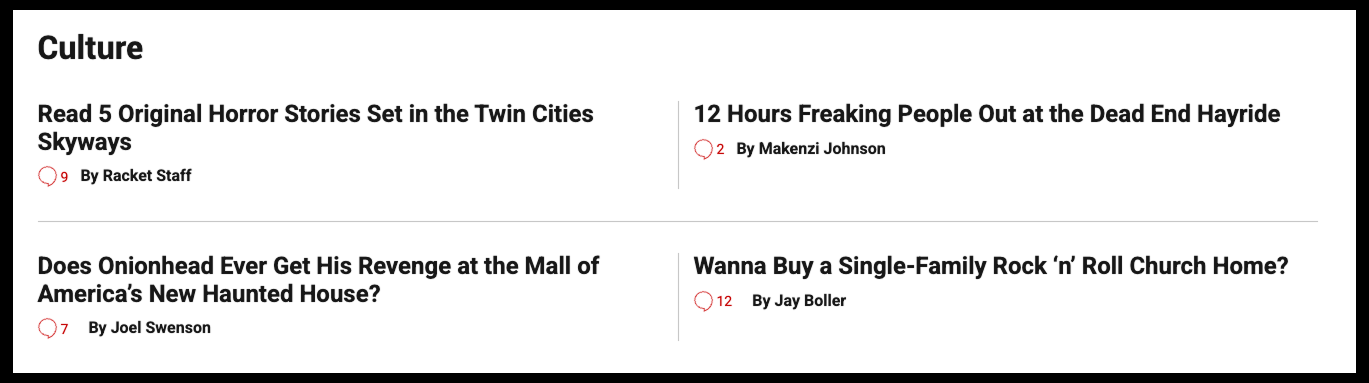
These options are shown with the maximum numbers of post, but will also work nicely with two or three posts, or even just one post.
Horizontal (default)
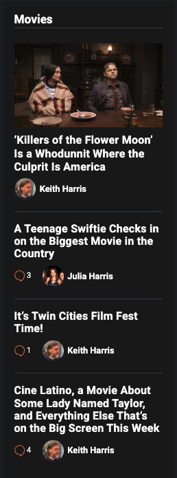
Vertical
works well in sidebars and small columns
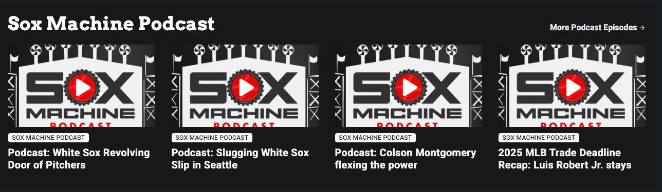
Grid
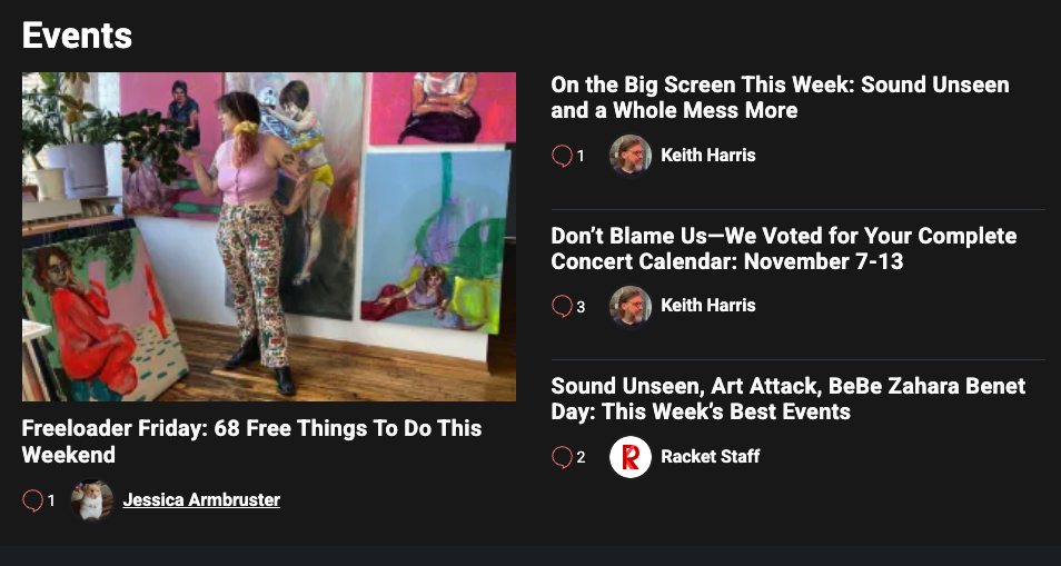
Two-column
Content Options
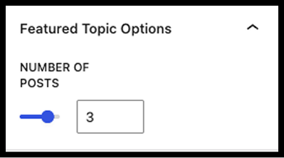
Number of Posts
The Featured Topics block can display up to four posts, except the vertical layout, which can accommodate six posts.
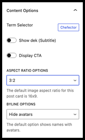
Show Dek (Subtitle)
The Featured Topics block can display the posts’ deks, or subtitles. They are hidden by default.
Display CTA
The Featured Topics block can display a link to the selected topic’s archive page.
- This is hidden by default
- The default text is “See All [Topic] posts,” but it can be customized
- The CTA displays at the top of the block for all layouts except the Vertical layout, where it displays at the bottom
Aspect Ratio Options
Adjust the aspect ratio on images used in all layouts except horizontal.
- 16:9 – default
- 3:2
- 1:1
Byline Options
The Featured Topic features the same Byline Options available on other homepage blocks.
- Default: byline with avatar
- Hide avatars
- Hide bylines
Lede Lite
A Lede Lite option is also availab⛭le for the Featured Topic block. The Lede Lite option removes the images from the block.
Styling Options
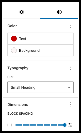
Use the styling tab in the block side bar (half-filled circle icon) to further customize the block.
- Add a background color
- Change the text color
- Change the font size of the heading
- Adjust the block spacing