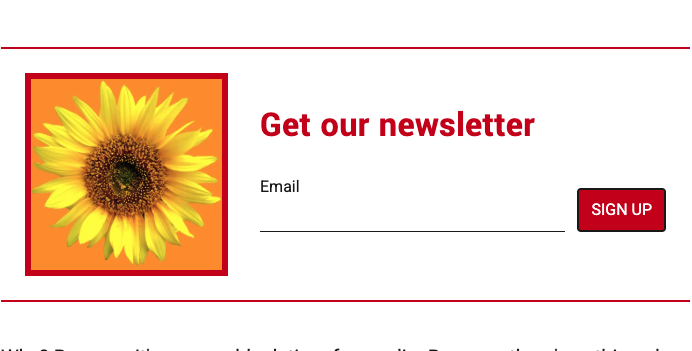
The Engagement Block is a smart, audience-aware container you can drop into your homepage, single pages, and single articles. Instead of showing the same call-to-action to everyone, it automatically shows a different view depending on who’s reading — so you never ask an existing subscriber to “subscribe” again, and you can thank paying readers instead of pitching them.
One block, three audiences, the right ask for each.
Quick Start
What it does
One block automatically shows a different call-to-action depending on who’s reading:
- Anonymous readers (not logged in) see a Newsletter signup
- Registered readers (logged in, not paying) see a Subscribe prompt
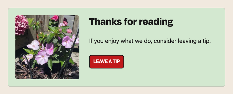
- Paying readers (active subscribers) see a Tip / Donate / Gift ask
On the live site, each reader sees only the one view that matches them.
Set it up in 4 steps
- Add the block. In the inserter, find Engagement Block (megaphone icon, under the Lede category). It comes pre-loaded with all three views.
- Edit each view. Change the heading, text, image, and button/form just like normal content. Use the editor preview toggle (see step 3) to switch to each view and design them all.
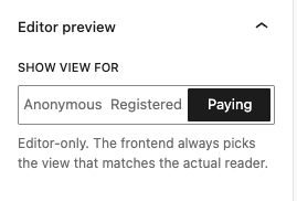
- Preview each audience. In the sidebar, go to Editor preview → Show view for and flip between Anonymous / Registered / Paying to check each one. (This only affects the editor.)
- Publish. Each reader automatically gets the right view.
The one setting to know
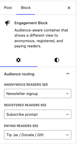
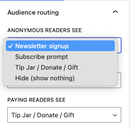
In the sidebar, the Audience routing panel lets you choose what each audience sees:
- Anonymous readers see → pick a view, or Hide
- Registered readers see → pick a view, or Hide
- Paying readers see → pick a view, or Hide
Any view can go to any audience, and Hide shows nothing to that group. Leave the defaults if you just want Newsletter → Subscribe → Tip.
Good to know
- One style set per block. Background color, overall block spacing, and border apply to whichever view shows. Need different looks per audience? Use two or three Engagement Blocks, each routed to one audience with the rest set to Hide.
- Centering: Center your heading and paragraph, then use the Alignment control on the Newsletter Form or button so the CTA lines up.
Full Details
How it works
The block comes with three built-in views — Newsletter, Subscribe, and Tip — and you decide which view each audience sees, or whether they see nothing at all.
Each view contains a heading, a paragraph, an optional image, and a call-to-action — a sign-up form in the Newsletter view, and a button in the Subscribe and Tip views.
Important: In the editor, you use the preview toggle to switch between and design each view one at a time. On the live site, only one view ever renders per reader — the one routed to their audience.
When to use it
- End-of-article CTA that asks anonymous readers to subscribe to your newsletter, invites registered readers to become paying members, and thanks paying readers with a tip/donate option.
- Adaptive prompt that adjusts to the reader, so you’re never asking an existing subscriber to “subscribe” again.
- Cross-sell: show all readers a Newsletter signup for a special-interest newsletter, or show anonymous readers a Subscribe prompt if that’s your priority. Any view can be shown to any audience.
- Suppress for an audience: e.g. show nothing to paying readers if you don’t want to ask them for anything.
How to use it
- Add the Engagement Block from the block inserter (look for the megaphone icon, under the Lede category).
- It starts with all three views inside it (Newsletter, Subscribe, Tip), each pre-filled with placeholder text, a heading, an optional image, and a call-to-action.
- Edit each view like any other content — change the heading, paragraph, image, button label, and link. Use the editor preview toggle to switch to the view you want to edit. The views are built from standard blocks, so you can add bullet lists, separators, and adjust text sizes.
- Use the Editor preview toggle to switch between the three audiences and confirm each one looks right.
- Publish. On the live site, each reader automatically sees only the one view that matches them.
Sidebar controls
Engagement Block (the container)
Audience routing panel — decide what each audience sees:
- Anonymous readers see — Newsletter signup / Subscribe prompt / Tip Jar / Donate / Gift / Hide (show nothing)
- Registered readers see — same options
- Paying readers see — same options
Every view is selectable for every audience, plus a Hide option to render nothing for that group.
Editor preview panel:
- Show view for — Anonymous / Registered / Paying. This only affects the editor so you can preview each audience’s view. The live site always picks the view that matches the actual reader, regardless of this setting.
Styling (applies to the container, shared by whichever view shows):
- Color — background and text color
- Spacing — padding, margin, and the gap between inner blocks
- Border — width, style, color, and corner radius. Borders can be set on all sides at once or per side (e.g. a top and bottom rule with no left/right border).
Newsletter Form (inside the Newsletter view)
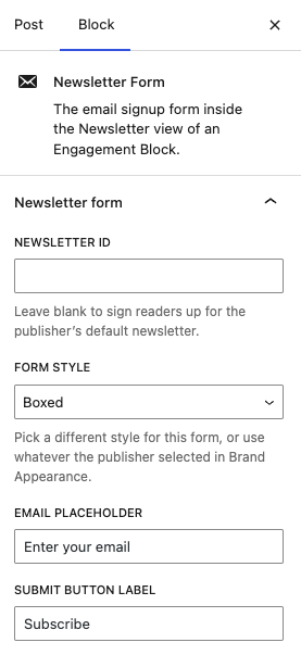
- Newsletter — a dropdown of your newsletters, listed by name. Leave it on Publisher default newsletter to use your default list, or pick a specific newsletter to target.
- Form style — Use publisher default (matches your Brand Appearance setting), or override per-form: Default, Animated Border, Pill, Shadow Pill, or Boxed.
- Email placeholder — the placeholder text in the email field.
- Submit button label — e.g. “Subscribe,” “Sign me up.”
- Alignment — left / center / right (in the block toolbar), so the form can be centered under a centered heading and paragraph.
Button Link (inside the Subscribe and Tip views)
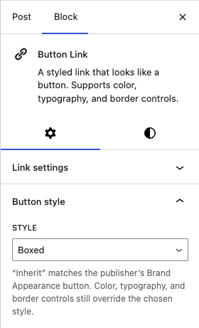
The CTA button is a flexible Button Link with full styling controls:
- Text and link (URL), with an open-in-new-tab option
- Color (background, text, link), typography (font, size, weight), and border (width, style, color, radius)
- Alignment — left / center / right
Limitations & things to know
- One style set, shared across views. The container’s color, spacing, and border apply to whichever view is showing. Since only one view ever renders per reader, this is by design — but it means you can’t give the Newsletter view a different background from the Subscribe view within a single Engagement Block. To do that, use multiple Engagement Blocks with the “Hide” routing (see Tips).
- Form styles are the platform’s available set. The five form styles are the styles available on the platform; you can’t apply arbitrary form styling.
- Each view uses a curated set of blocks. Views accept images, headings, paragraphs, lists, separators, and their form/button — this keeps them clean and on-brand (you can’t, for example, nest unrelated blocks inside a view).
Tips
- Use the Editor preview toggle constantly. It’s the only way to see what each audience will get; flip through all three before publishing.
- “Hide” is your friend. If you only want to talk to one or two audiences on a given page, set the others to Hide rather than leaving a generic message.
- For fully custom per-audience designs, place two or three Engagement Blocks in a row, each routed to a single audience (the others set to Hide). Now each block can have its own background, border, and layout.
- Centering a form or button: set the heading and paragraph to centered, then use the Alignment control on the Newsletter Form / Button Link so the CTA lines up under them.
- Cross-sell deliberately. Showing paying readers a Newsletter signup (with a specific newsletter selected) is a great way to grow a secondary newsletter among your most engaged audience.
- Add an image to a view for a two-column look. The image always sits on the left on desktop and on top on mobile.
- Borders per side make tasteful dividers: a top + bottom rule with no side borders reads as a clean “section” separator.