The Accordion block stacks content into sections that readers open and close. Each section has a heading that works as a button: click it and the content underneath opens, click it again and it closes. It suits FAQs, reference material and anything readers want to scan before they dive in.
Accordion is WordPress’s own block. Find it in the Design category of the block inserter, or type /accordion. It’s available in posts and pages, including your homepage. It isn’t available in newsletters.
How an accordion is put together
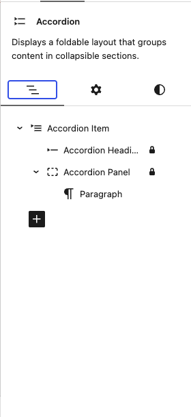
An accordion is four blocks nested inside each other. You’ll see their names in List View and at the top of the sidebar, and each one has its own settings:
- Accordion is the whole block. Settings that apply to every section live here.
- Accordion Item is one section: a heading and a panel.
- Accordion Heading is the clickable title of a section.
- Accordion Panel is the content that opens under the heading.
List View is the easiest way to select the part you want. This matters most for an Accordion Item, because clicking in the editor usually selects the heading or panel inside it.
Adding sections and content
A new accordion starts with one item. Type its title where it says Accordion title, then click into the panel below it to add content.
To add an item, select the Accordion block and click Add item in its toolbar, or click the + at the bottom of the block. To reorder items, select one and use the move arrows in its toolbar, or drag it in List View. To remove one, select the Accordion Item and delete it as you would any block.
Every item is exactly one heading and one panel. You can’t delete an item’s heading or give it a second panel.
A panel takes the same blocks you can use anywhere else in the post: paragraphs, lists, images, embeds, even another accordion. Headings are simpler. You can make words bold or italic, but a heading can’t contain a link or a line break.
In the editor, an item opens while you’re working in it, so click a heading to see and edit its panel. Items set to Open by default stay open. This is only a preview, and it doesn’t change what readers see.
Accordion settings
Select the Accordion block to find the settings that apply to every item in it.
| Setting | Where to find it | What it does |
|---|---|---|
| Heading level | Toolbar | Sets the level of every heading in the accordion, from H1 to H6. The default is H3. |
| Add item | Toolbar | Adds a new item at the end of the accordion. |
| Align | Toolbar | Makes the accordion wide or full width. By default it matches your content width. |
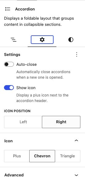
| Auto-close | Sidebar, Settings panel | When a reader opens an item, any other open item in the same accordion closes. Off by default. |
| Show icon | Sidebar, Settings panel | Shows an icon on each heading that changes when its item opens. On by default. |
| Icon Position | Sidebar, Settings panel | Puts the icon on the Left or Right of each heading. The default is Right. Only shown when Show icon is on. |
| Icon | Sidebar, Icon panel | Plus, Chevron or Triangle. The default is Plus. Only shown when Show icon is on. |
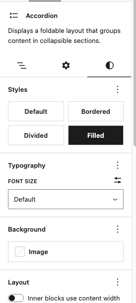
| Style | Sidebar, Styles tab | Default, Bordered, Divided or Filled. |
The help text under Show icon says it displays a plus icon, but the toggle turns off whichever icon you’ve chosen.
Choose the heading level for structure, not size. Accordion headings use your site’s Extra Small heading size at every level, so changing the level doesn’t change how they look. Screen readers and search engines do use it to understand the page’s outline, so pick the level one below the section the accordion sits in. Under an H2, for example, use H3.
Set the heading level after you’ve added all your items, or choose it once more when you’re done. Items added with the + at the bottom of the block can miss a level you chose earlier. Items added with Add item in the toolbar don’t have this problem.
Icons

With Show icon on, choose an icon in the Icon panel. Each one moves when its item opens:
- Plus turns into an ×.
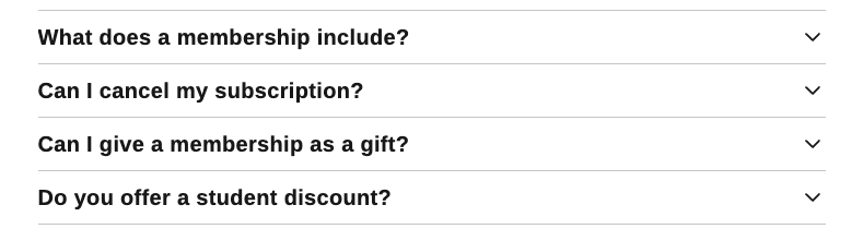
- Chevron points down, then flips to point up.
- Triangle points right, then turns to point down.
The icon takes the heading’s text color, so it always matches the heading, in light and dark mode. Readers who have set their device to reduce motion see the icon change without the animation.
Turning Show icon off keeps your icon choice, so the same icon comes back when you turn it on again.
The Icon setting is saved as a class, has-icon-chevron or has-icon-triangle, which you’ll see under Advanced in Additional CSS class(es). Leave it there. Deleting it sets the icon back to Plus.
Block styles
Pick a style in the Styles tab. Any style works with any icon and icon position.
- Default has no borders or background. Headings and content sit on the page, with space between items.
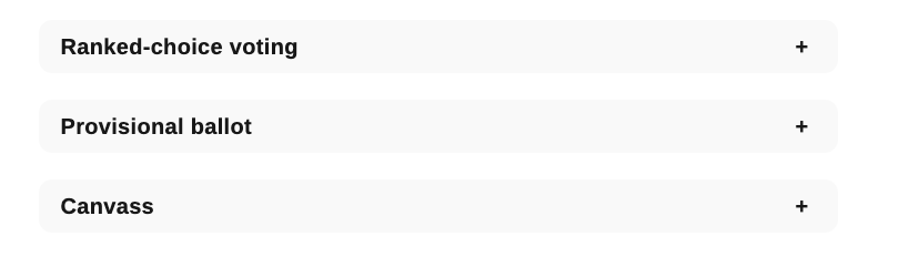
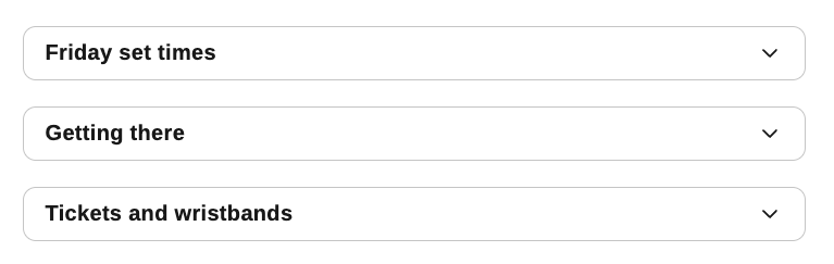
- Bordered puts each item in a light outlined box with rounded corners and padding inside.
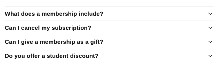
- Divided separates items with thin lines and no space between them. It’s compact, and a classic look for an FAQ.
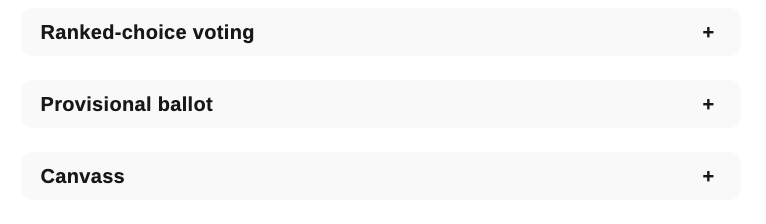
- Filled puts each item on a lightly shaded background with rounded corners and padding inside.
All four use your site’s theme colors and adapt to dark mode on their own.
A style is a starting point. Any border, color or padding you set in the sidebar overrides the style’s own. The one exception is Divided, which ignores Block spacing between items because the lines replace that space.
Opening an item by default
Select an Accordion Item and turn on Open by default in its Settings panel. That item is open when the page loads, and readers can still close it. You can set this on as many items as you like.
Design controls
Each of the four blocks has its own design controls in the Styles tab, so you can style the whole accordion, one item, or a single heading or panel.
| Block | Design controls | Worth knowing |
|---|---|---|
| Accordion | Color (text, background, gradient), background image, typography, border and radius, shadow, padding, top and bottom margin, block spacing | Block spacing sets the space between items. |
| Accordion Item | Color (text, background, gradient), typography, border and radius, shadow, padding, top and bottom margin, block spacing | Block spacing sets the space between the heading and the panel. |
| Accordion Heading | Color (text, background, gradient), typography, border and radius, shadow, padding | Padding sets the size of the clickable area. |
| Accordion Panel | Color (text, background, gradient), typography, border and radius, shadow, padding, block spacing | Block spacing sets the space between blocks inside the panel. |
How these settings combine:
- A text color set on the Accordion or on an item applies to its headings as well as its panel text.
- Other typography set on the Accordion, an item or a panel, such as font size, styles the panel text. Headings keep their own font, size and weight. To change those, select a heading and use its own Typography settings.
- To give every heading the same look, style one, then use Copy styles from its options menu (⋮) and Paste styles on each of the others.
In dark mode, text and background colors you set on any part of an accordion are replaced with your dark theme’s colors, so text stays readable. Borders keep the color you chose, so pick one that shows up on both light and dark backgrounds. If your site offers dark mode, a block style is often a better choice than custom colors.
What readers see
- Items start closed, except those set to Open by default.
- Readers open an item by clicking its heading. Keyboard users can Tab to a heading and press Enter or Space. Screen readers announce each heading’s level and whether its item is open or closed.
- With Auto-close on, opening an item closes the one that was open.
- Searching the page with Ctrl+F (Cmd+F on a Mac) finds text inside closed items and opens the item with the match. Most current browsers support this. In a browser that doesn’t, readers need to open the item first.
- Everything inside closed items is part of the page, so search engines index it.
Linking to something inside an accordion
You can link straight to content inside an item, from the same page or from anywhere else. When a reader follows the link, the item opens and the page scrolls so the content sits just below your site’s header.
- Select a block inside the panel, such as a paragraph or a heading.
- In the sidebar, open Advanced and enter a short name under HTML anchor, for example
refund-policy. - Link to
#refund-policyfrom the same page. To link from anywhere else, add#refund-policyto the end of the page’s URL.
Put the anchor on a block inside the panel, not on the Accordion Heading. A link to a heading’s anchor scrolls to the heading but leaves its item closed.
Hiding an item
To hide one item without deleting it, select the Accordion Item, open its options menu (⋮) and choose Hide. Choose Omit from published content to hide it everywhere, or pick the devices to hide it on. A heading or panel can’t be hidden on its own, so hide the whole item instead.
Common uses
- FAQs on a membership, events or support page, with each question as a heading. The Divided style suits these well.
- Event and festival guides: lineups, set times, venue details, tickets and accessibility information, with one item per topic or per day.
- Explainers and reference material, such as a glossary, a timeline by year, or a race-by-race election guide that readers scan for the part they need.
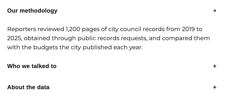
- “How we reported this”: methodology, sourcing and data notes at the end of an investigation, there for readers who want them without lengthening the story.
- Spoilers: results, endings and plot details that readers choose to reveal.
- Staff and about pages, with a bio under each name, or your ethics, corrections and comment policies gathered on one page.
When to use something else
- Don’t put anything every reader needs in a closed item, such as the main point of a story, a correction or a disclosure. Many readers never open them.
- A single item rarely needs an accordion. A heading and a few paragraphs will do.
- To let readers switch between a few alternatives on a page, try the Tabs block. Tabs are for pages only. Accordions work in posts too, and they handle long headings better on phones.
Pro tips
- Write headings the way readers would ask. “Can I cancel my subscription?” scans better than “Cancellations.”
- Turn on Auto-close for long accordions, so the page doesn’t keep growing as readers open items.
- If readers might not realize the headings open, set the first item to Open by default.
- Use Bordered or Filled to set an accordion apart from the article text around it.
- Preview on a phone. Long headings wrap onto several lines there, so keep them short.