About
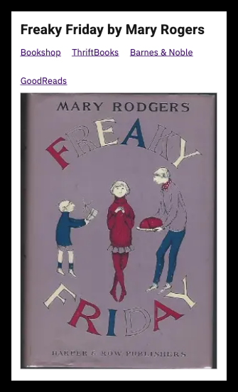
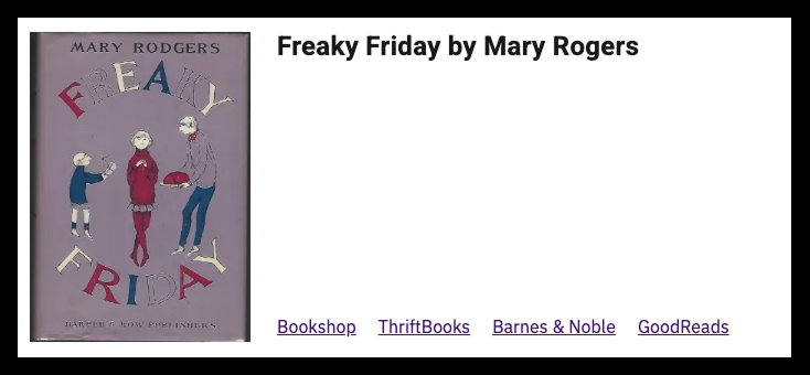
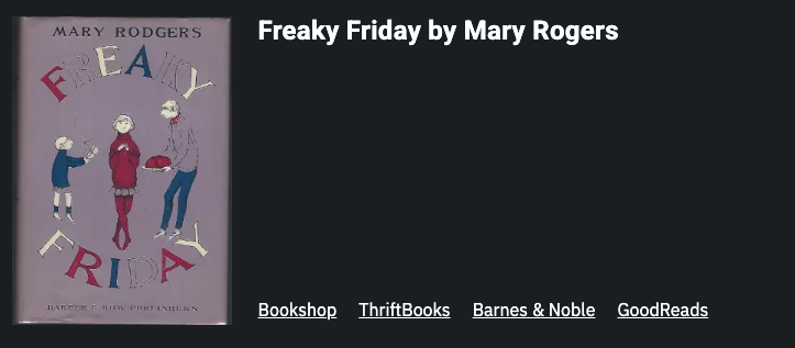
A compact, versatile component that showcases content through three key elements: a visual image, a descriptive heading, and multiple action links. This component can be used to highlight books, albums, videos, products, team members, events, or any content that benefits from visual representation with multiple access points
Works well with the Flex List Item to create eye-catching listicles.
What’s Inside this Block
The block includes an image, a heading, and optional links or sources.
The image has a maximum width of 200px on desktop and a maximum width of 100% of mobile.
There are no settings for the this block.
Block Availability
This block is available on Posts and Pages.
Initial Block Setup
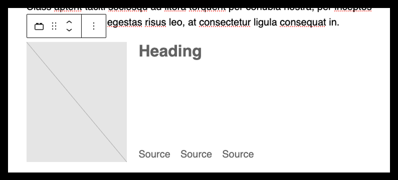
The block contains placeholder content for the image, heading, and three sources. The source placeholders can be removed; additional sources can be added.
Pro Tips & Best Practices
- Use square or portrait-oriented images for best visual impact
- Consider using consistent aspect ratios when using multiple Media Card blocks together in one post
- This block has versatile applications
- Products with multiple purchase links
- Event listings with registration, details, and social sharing options
- Team member profiles with contact methods and social links
- Resource collections with multiple access points (download, share, view)
- Products with multiple purchase links
- Event listings with registration, details, and social sharing options
- Team member profiles with contact methods and social links
- Resource collections with multiple access points (download, share, view)
Examples
Mobile – Light Mode